Application Description
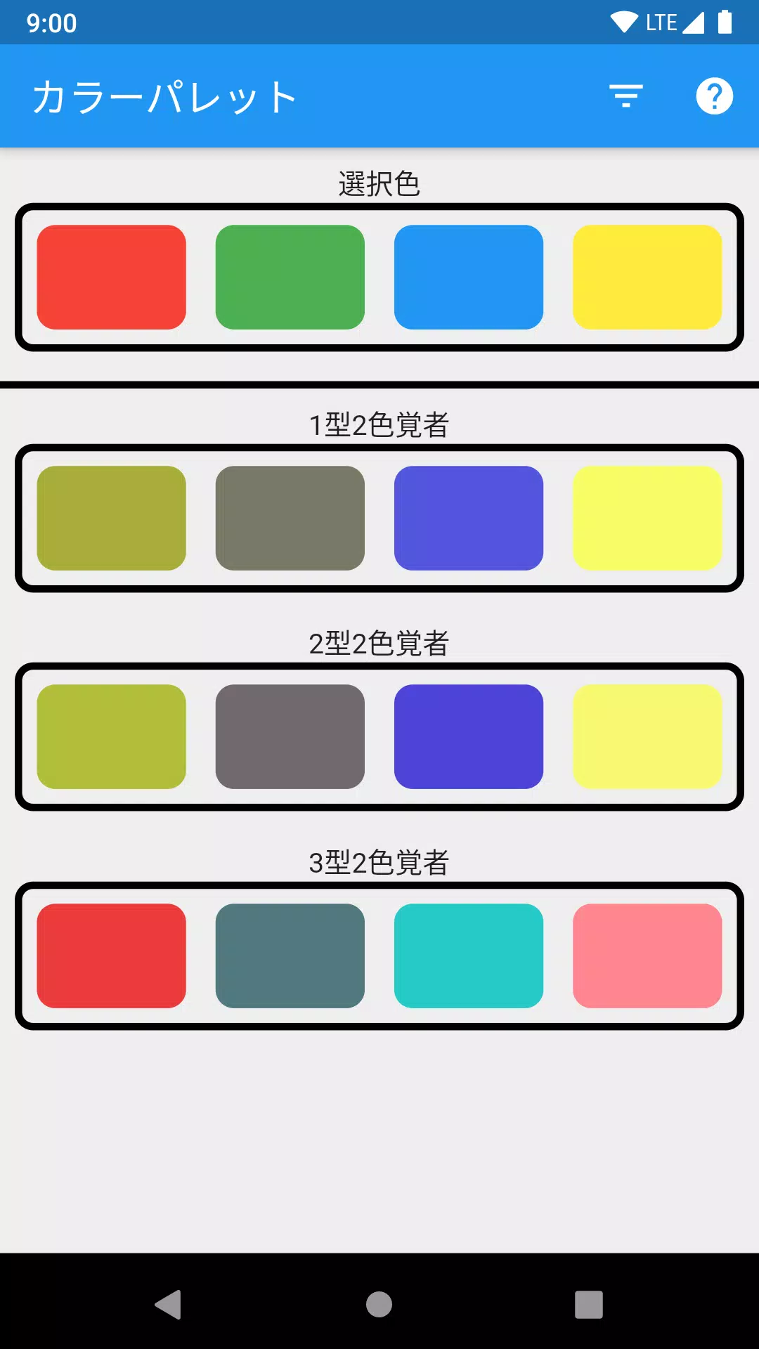
Color Palette for Color Blindness Accessibility
This application helps evaluate color selections by simulating how they appear to people with different types of color vision deficiencies.
Key Features
- Test up to 4 colors simultaneously
- Visualize color perception for each type of colorblindness
- Simple interface with intuitive controls
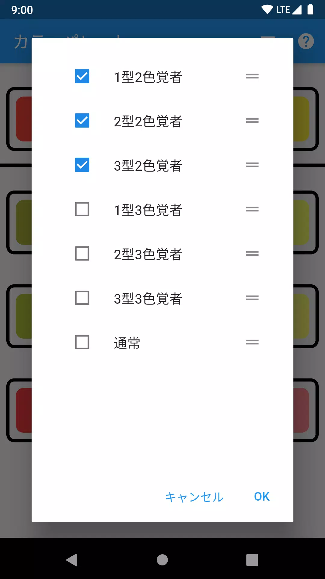
Usage Instructions
Detailed usage guidance is available by selecting the "?" icon in the top-right corner of the screen.
The tool helps designers create more accessible color schemes by identifying potential visibility issues for users with:
- Protanopia (red-blindness)
- Deuteranopia (green-blindness)
- Tritanopia (blue-blindness)
Select colors via our color picker or enter specific color codes to analyze their accessibility.
カラーブラインドパレット Screenshots